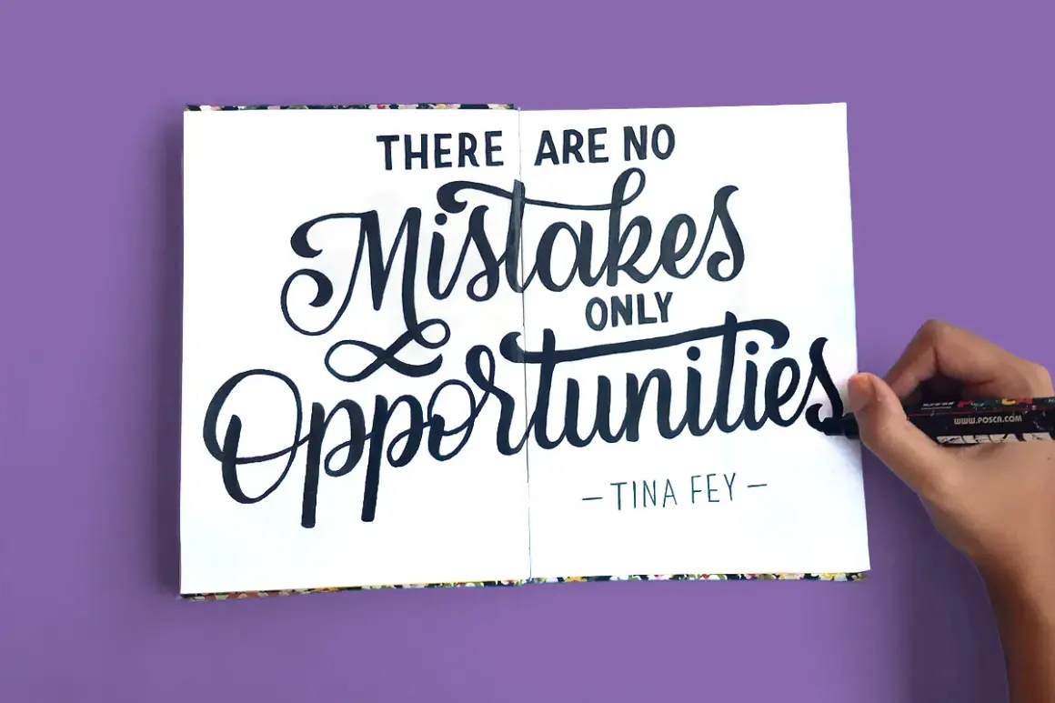
Script works best when the mood is clear and the reading stays easy
- Script usually works as an accent, not as a long-form reading style.
- Different script families create very different signals, from formal and luxurious to casual and handmade.
- Short names, headers, and highlight words are the safest places to use it.
- A quiet serif or sans serif companion keeps the layout balanced.
- Most problems come from weak spacing, too much ornament, or using script at a size that cannot support it.
What script lettering really communicates
Script is one of the fastest ways to add personality to a page. I read it as motion first and language second: the slant, the joins between letters, and the thickness of the strokes all tell me something before I even focus on the words themselves. That is why the same wording can feel refined, playful, intimate, or old-fashioned depending on the script treatment.
In American design, script shows up everywhere from wedding suites and boutique packaging to cocktail menus, album art, and event posters. It can suggest celebration, craftsmanship, luxury, or a personal signature, but only when the style matches the message. If the mood and the content fight each other, the design starts to feel confused instead of expressive.I usually think about script as a visual voice. Some voices are soft and conversational, some are dramatic and theatrical, and some are polished enough to carry a premium brand on their own. Once you know what the lettering is saying emotionally, it becomes much easier to choose the right style for the job, and that leads straight to the major script families.
The main script styles and how they differ
Not all script looks are built for the same purpose. A formal calligraphic face can feel completely wrong in a casual lifestyle brand, while a loose brush script can look awkward on a luxury invitation. I find it easier to choose once I separate the styles by structure, energy, and risk.
| Style | Visual feel | Best use | Main risk |
|---|---|---|---|
| Formal calligraphy | Elegant, controlled, ceremonial | Invitations, monograms, premium branding | Can become stiff or overly ornate |
| Brush script | Energetic, modern, handmade | Posters, social graphics, creative campaigns | May look messy if spacing is weak |
| Casual cursive | Friendly, relaxed, familiar | Lifestyle brands, packaging, editorial accents | Can feel generic if the form is too common |
| Signature script | Personal, minimal, refined | Logos, author marks, celebrity-style branding | Thin strokes may disappear at small sizes |
| Flourished display script | Dramatic, theatrical, expressive | Headlines, feature art, luxury event pieces | Can overwhelm the rest of the layout |
I treat this table as a reality check. If the style’s personality fights the message, no amount of decoration will fix it. That is why I always decide on the use case first, which is the next question designers need to answer.
How I choose the right script for a project
The smartest script choice is rarely the most decorative one. I look at four things first: how much text I need to show, how far away the piece will be read, how much contrast the layout already has, and whether the script is supposed to lead or support the design. Those questions save more mistakes than any trend report ever will.
For logos and wordmarks
For a logo, I prefer script when the name is short and memorable. One to three words is usually the sweet spot because script depends on shape recognition, not just letter recognition. If the brand name is long, full of unusual letters, or likely to be reduced to a tiny favicon, I become cautious very quickly.
I also check whether the script has enough structure to survive use in the real world. A beautiful logo that collapses on a small social avatar, a storefront sign, or a one-color stamp is not really a finished logo. In practice, that means keeping the strokes clean, the spacing intentional, and the flourishes controlled.
For invitations and event pieces
This is where script often looks most natural. Weddings, cabaret nights, private dinners, and gallery openings can all benefit from a letterform that feels ceremonial without becoming cold. Here, I usually let script handle the names, the title, or one memorable line, then let a simpler typeface carry the date, location, and practical details.
The reason is simple: event pieces need hierarchy. If every line is written in the same expressive style, the eye has nowhere to rest. Script works best when it creates a focal point and then steps aside so the rest of the information remains usable.
Read Also: Design Like Spotify Wrapped - Master the Visuals
For packaging and social graphics
Packaging wants quick recognition, and social content wants immediate impact. That makes script useful for a hero word, a flavor cue, or a short campaign phrase, but not for dense information. I will often use script to add warmth to a label, then rely on a plain sans serif to keep ingredients, prices, or captions readable.That mix matters because packaging and social graphics are often scanned in motion. A script that reads beautifully at rest can still fail if it turns blurry on a phone screen or loses clarity on a shelf. The next step is making sure the script has the right companion around it, not just the right shape on its own.
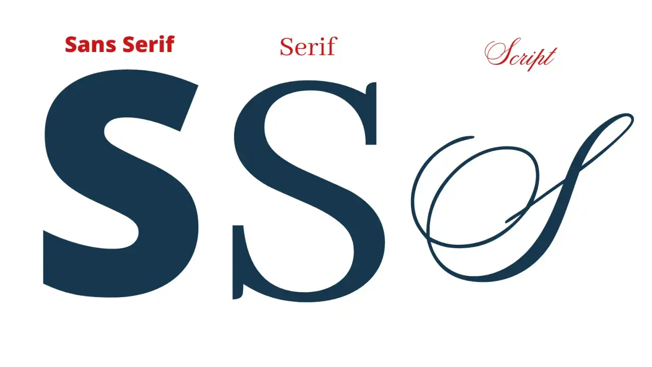
How to pair script with other typefaces
Script rarely performs best when it is left alone. A good companion face makes the script feel intentional, while a poor one makes the whole layout look busy or improvised. I usually want the supporting type to be calm, straightforward, and slightly less emotional than the script itself.
- Pair script with a serif when you want a classic, editorial, or luxury feel. The serif gives the page structure while the script adds warmth.
- Pair script with a neutral sans serif when you want a more modern balance. This works well for beauty brands, creative studios, and event graphics.
- Use a slab serif when the design needs a stronger poster-like contrast. It can make a script title feel grounded instead of fragile.
- Avoid pairing script with another decorative face unless you want the whole composition to feel intentionally extravagant. Two expressive fonts usually compete instead of cooperate.
I also watch letter spacing closely in mixed-type layouts. Script usually needs breathing room, and the surrounding text should not crowd it. The easiest rule I use is simple: let one typeface speak with personality and let the other do the explaining. That balance is what separates a polished composition from a noisy one, and it becomes even more important when you start spotting common mistakes.
Common mistakes that make script lose its charm
Most weak script use does not come from the font itself. It comes from overuse, bad scaling, or a mismatch between style and setting. I see the same handful of problems again and again.
- Using script for too much text makes the layout tiring and slows reading to a crawl.
- Choosing an ornate face for small sizes causes fine strokes and loops to disappear.
- Stretching or compressing the letters breaks the natural rhythm and makes the design look cheap.
- Putting script on a busy background kills contrast and makes the wording work harder than it should.
- Overdoing flourishes turns the lettering into decoration with no clear message behind it.
- Ignoring spacing makes even a good script feel cramped, especially in headlines and logos.
My practical test is always the same: can I read it at the speed the design requires, and does it still look intentional when I step back? If the answer is no, I simplify before I polish. That habit matters now more than ever, because current design trends reward clarity just as much as personality.
Why script still feels current in 2026
Script has not disappeared, but its role has changed. In a visual culture full of templates, automation, and fast-turn content, hand-shaped lettering stands out most when it feels specific rather than generic. I see it used well in brand marks, motion graphics, event teasers, premium packaging, and short social headlines where a little human texture goes a long way.
What keeps it relevant is restraint. The strongest uses in 2026 are not the loudest ones; they are the ones that know exactly when to stop. I reach for script when I want a design to feel personal, ceremonial, or crafted, but I still keep the reading path simple. That is the real lesson: the style should add emotion without making the message harder to understand.
When I apply that rule, script stops being a decorative extra and becomes a genuine design tool. Used with control, it can make a page feel warmer, more memorable, and more human without losing precision.