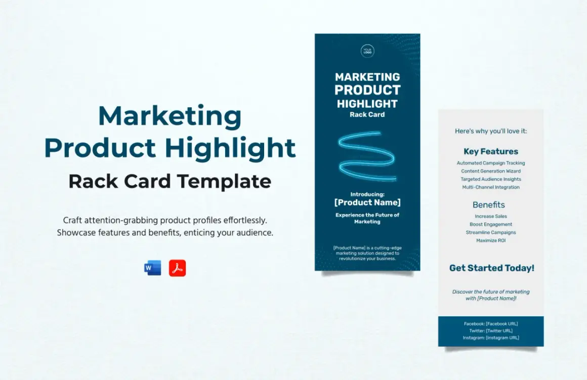
What matters most in a product catalog
- Start with the buyer’s job: browsing, comparing, requesting a quote, or placing an order.
- Build the structure first so categories, variants, and pricing stay consistent.
- Use a clean visual system with strong hierarchy, restrained typography, and purposeful imagery.
- Choose print, digital, or a hybrid format based on how often products, prices, and inventory change.
- Keep product copy short, specific, and aligned with the brand voice.
- Prepare files carefully so the final catalog matches the master data and the printer’s requirements.
Start with the buying job, not the page count
Before I think about layouts, I ask one simple question: what is this catalog supposed to do? A trade buyer usually needs specifications, variant details, and fast comparison. A consumer-focused catalog may need more mood, styling, and a stronger emotional hook. In practice, the same brand might need both, because a wholesale line sheet and a seasonal lookbook solve different problems.
That is why audience definition matters more than decoration. If the reader is comparing products, the catalog should make comparison easy. If the reader is being inspired, the catalog should slow them down just enough to create desire. I often find that catalogs fail when they try to be everything at once and end up helping no one.
Once the buyer’s job is clear, the structure becomes much easier to build.
Build the information architecture before you decorate anything
Good catalogs are organized like a good store floor: the customer should know where to look next. I usually group products by collection, use case, price tier, season, or audience, depending on what makes the shortest path from interest to decision. For a fashion brand, that might mean separating occasion wear from basics. For a home or entertainment brand, it might mean organizing by room, event type, or theme.
The data itself needs discipline too. Every sellable variant should have its own SKU, image, and price, while related variants stay tied together through a parent product or family reference. That sounds technical, but it prevents confusion later. Inconsistent naming, duplicate entries, and half-filled fields make the catalog feel unreliable even when the visuals look polished.
- Use one naming convention for brands and products.
- Keep variant data separate enough to be shoppable, but grouped enough to stay logical.
- Make sure prices, sizes, materials, and availability are written the same way throughout.
- Remove duplicates before the design stage, not after it.
If the structure is clean, the page layout can do its job instead of compensating for chaos.
Make every spread easy to scan
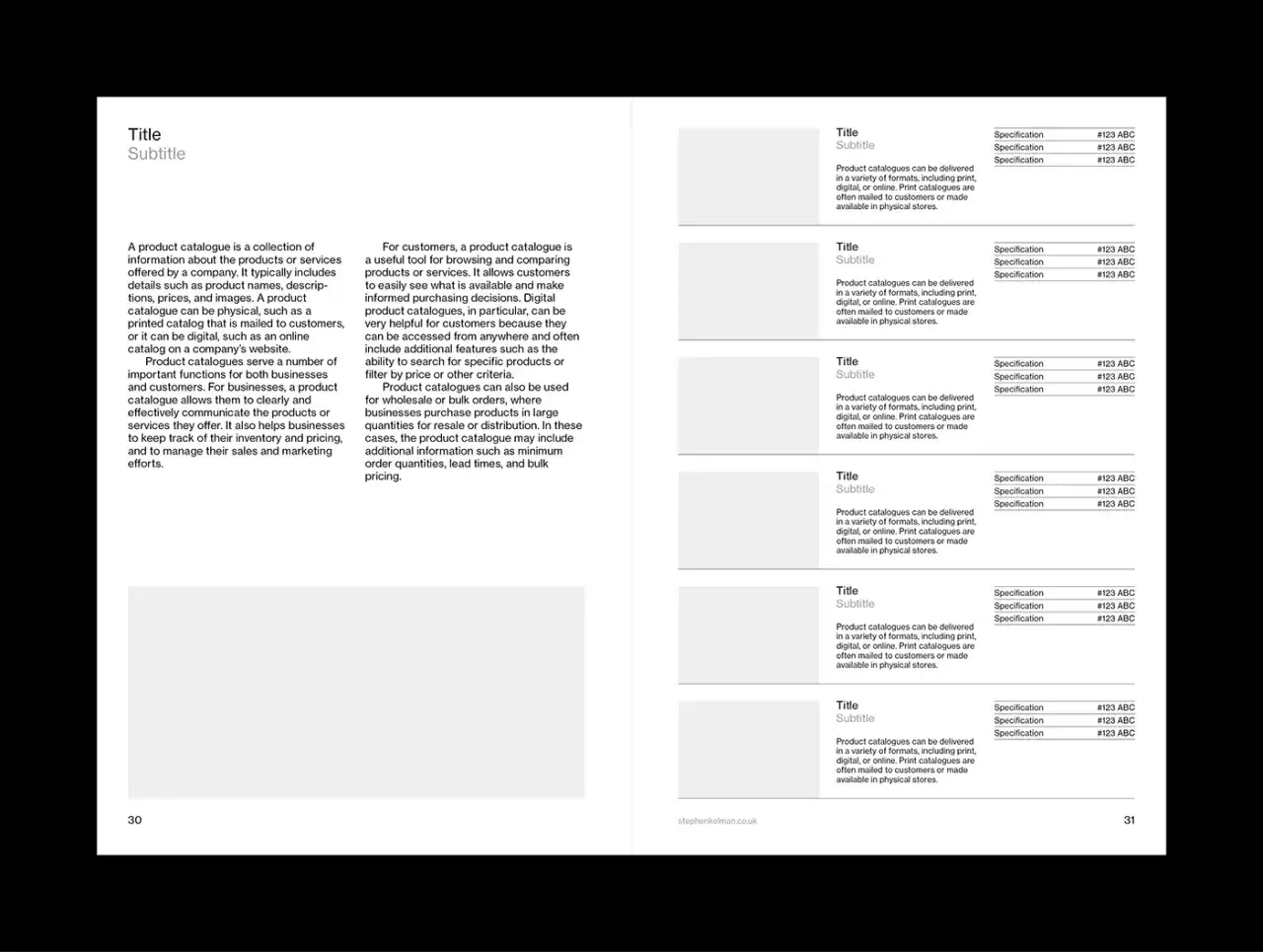
I think of the page as a visual route, not a canvas. The eye should know where to land first, what comes second, and what can wait. That usually means a clear grid, consistent alignment, and enough white space to let each product breathe. Clutter may look energetic in a mockup, but in a real catalog it usually lowers trust.
Typography does a lot of heavy lifting here. A simple system is usually best: one type family for headings, one for body text, and a third only if there is a strong reason. For print, body copy often works best around 9 to 11 pt depending on the font, while headlines need to be large enough to guide the spread at a glance. I would rather see a catalog with a disciplined hierarchy than one with five fonts and no visual order.
Use image hierarchy on purpose
Not every product deserves the same visual weight. Hero items need larger photography, more breathing room, and a stronger headline. Supporting items can live in tighter grids as long as the spacing and labels stay consistent. This is one of the easiest ways to make a catalog feel premium without adding more pages.
Let the brand tone show through the layout
A minimalist label, a bold event brand, and a heritage-style maker should not use the same visual rhythm. Editorial spacing, dramatic crops, and a restrained palette can feel elegant. Brighter color, denser grids, and more category markers can feel lively and commercial. The best layout choice is the one that makes the product feel inevitable for that audience.
Once the layout feels readable, the next decision is whether the catalog should live on paper, on screen, or in both places.
Choose the format that fits the job
In 2026, I usually treat format choice as a business decision, not a purely design one. If pricing changes often, inventory is live, or you want analytics, a digital catalog is usually the smarter default. If you need a tactile brand moment at a showroom, a trade fair, or a premium launch, print still has real force. Many teams end up with a hybrid setup because each format solves a different part of the buying journey.
| Format | Best for | Strengths | Limits | Design priorities |
|---|---|---|---|---|
| Showrooms, events, luxury brands, sales teams | Tactile, memorable, strong perceived value | Harder to update; higher production and shipping effort | CMYK files, bleed, paper choice, proofreading, image quality | |
| Digital | E-commerce, frequent updates, global distribution | Fast changes, links, analytics, lower distribution cost | Can feel flat if the interface is poorly designed | RGB export, readable on mobile, alt text, clickable CTAs |
| Hybrid | Brands that need both sales support and marketing reach | Flexible across channels, easier repurposing | Requires more coordination to keep everything consistent | One master system that adapts cleanly across formats |
If your catalog has live pricing or stock, digital usually protects accuracy better. If the goal is to create a collectible object, print deserves more attention. The wrong format can undermine even excellent design, which is why the next layer matters just as much: the words that sit beside the images.
Write copy that supports the visual story
Catalog copy should be short, specific, and useful. I try to keep each description focused on what the product is, why it matters, and what the buyer needs to know before acting. That usually means one concise benefit line, one or two proof points, and only the specs that actually influence the decision.A simple formula works better than elaborate prose: product name, key benefit, standout detail, and a clear action. For example, a decor item may need material and size, while a premium jacket may need fit, fabric, and care notes. The same rule applies to creative lifestyle brands and entertainment merchandising: the tone can be expressive, but the facts still have to be easy to find.
- Lead with the benefit, not the brand jargon.
- Use consistent units and formatting for measurements.
- Keep calls to action obvious: shop, inquire, request a line sheet, or book a consultation.
- If the catalog is digital, add alt text that actually describes the image. Alt text is the short written description used by screen readers and search tools.
Good copy makes the catalog easier to use; sloppy copy makes the design feel less credible. After that, the file preparation stage is what decides whether the finished piece looks intentional or rushed.
Prepare files like they are going to press tomorrow
This is the part people underestimate. A catalog can look beautiful on a screen and still fail in production if the files are not handled carefully. For print, I usually treat 300 dpi as the safe baseline for images, use CMYK color, and leave 0.125 in of bleed with at least 0.25 in of safe margin. Those numbers are not decoration; they are what keep trim errors and edge cropping from wrecking the final result.
For digital, I think differently. RGB is the right default, file size matters, and links need to work cleanly on mobile as well as desktop. A standard 8.5 x 11 in page size often adapts well across devices because it gives enough room for both single-page viewing and spread viewing, but the real test is still the user experience. If the catalog feels cramped on a phone, the layout needs to change.Read Also: Gradient Color Guide - Design Intentional, Polished Visuals
What I check before approval
- All prices match the master data.
- Fonts are embedded or outlined as required.
- Images are sharp at the final size, not just in preview.
- Page numbers, section markers, and CTAs are consistent.
- The printer’s export preset or digital platform requirements have been followed exactly.
When the technical side is tight, the next job is spotting the mistakes that still make a catalog feel less effective than it should.
Avoid the mistakes that quietly weaken the catalog
Most weak catalogs do not fail because of one dramatic issue. They fail because of a handful of small ones that compound. Too many typefaces, inconsistent photography, stale pricing, vague copy, and cluttered pages all make the catalog harder to trust. The reader may not be able to explain why the piece feels off, but they will feel it.
I also watch for a specific trap: trying to make every product look equally important. That usually destroys hierarchy. A catalog should help the buyer notice the collection highlights, the new arrivals, or the premium items first. If everything competes for attention, nothing leads.
- Do not bury the featured items inside a wall of equal-sized blocks.
- Do not mix studio shots, cutouts, and lifestyle images without a clear rule.
- Do not leave old prices, duplicate SKUs, or inconsistent variant names in place.
- Do not make the main action hard to find.
Fixing those problems usually improves the catalog more than adding extra pages ever will. That brings me to the few choices I would prioritize if I were building one from scratch today.
The three decisions that do the heavy lifting
If I had to simplify the whole process, I would focus on three decisions: structure, imagery, and data quality. Structure helps the buyer navigate. Imagery creates desire and establishes brand tone. Data quality keeps the catalog honest, current, and easy to maintain. Those three things carry more weight than most decorative flourishes.
There is also one quick test I use before sign-off: can a reader understand what the catalog sells, what looks important, and what to do next in under 10 seconds? If the answer is no, I keep refining the hierarchy. If the answer is yes, the catalog is probably doing its job.
A well-built catalog feels effortless because a lot of discipline sits underneath it. When the layout, copy, format, and production details all point in the same direction, the result looks polished without trying too hard.