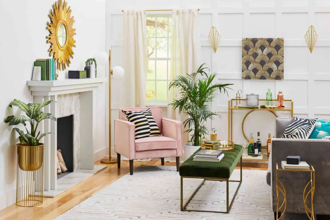
Art Deco is the design language of speed, luxury, and precision. It pairs clean geometry with polished surfaces, which is why it still feels at home in skyscrapers, hotel lobbies, posters, jewelry, and stage sets. The real answer to what is art deco is broader than a decorative label: it is a style that made modern life look glamorous without losing its sense of order.
Art Deco is the style that turns geometry into glamour
- It emerged in the 1920s, gained momentum after the 1925 Paris exposition, and remained influential through the 1930s.
- Geometry, symmetry, and stepped forms are its easiest visual clues.
- Its materials often signal luxury, including chrome, lacquer, marble, glass, brass, rare woods, and gilded finishes.
- It appears across architecture, interiors, fashion, graphics, and entertainment spaces, especially in the United States.
- It sits between ornament and restraint, which is why it feels more polished than Art Nouveau and more decorative than strict modernism.
How to recognize Art Deco at a glance
If I had to reduce Art Deco to a quick visual test, I would start with shape. The style tends to prefer symmetry, repetition, and crisp edges over soft, organic movement. It often looks composed and theatrical at the same time, like it knows exactly where the eye should go.
- Stepped silhouettes that rise like a ziggurat or a stylized skyline.
- Chevrons, zigzags, and sunbursts used as ornament rather than just decoration.
- Strong vertical lines in buildings and furniture, which create a sense of momentum.
- Glossy or reflective finishes that catch light and make the surface feel expensive.
- Stylized motifs such as fountains, fans, leaves, animals, and human figures reduced to clean forms.
When a design feels polished, balanced, and a little dramatic without becoming fussy, you are usually in Deco territory. Once those cues are clear, the style’s history becomes much easier to read.
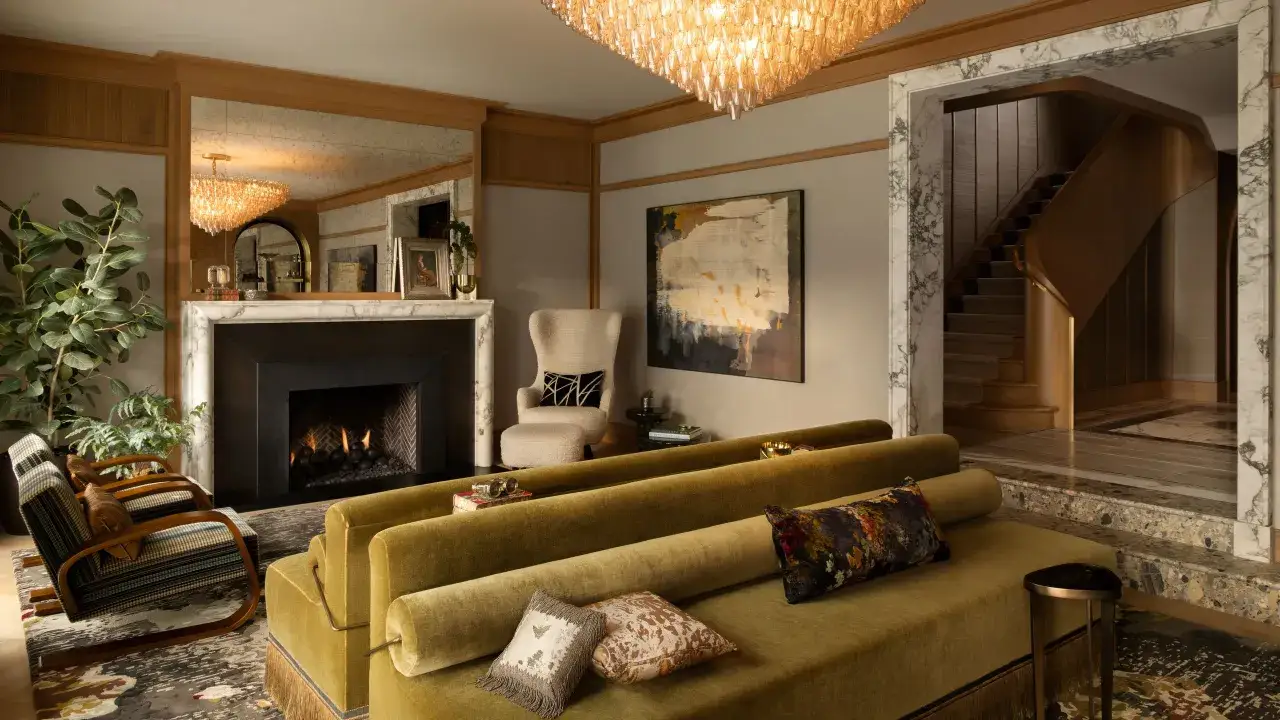
The visual elements that define it
The easiest mistake people make with Art Deco is treating it as one single look. In practice, it is a family of related looks held together by a shared taste for modern elegance. The style can feel luxurious, industrial, exotic, or streamlined, but it almost always keeps its lines tight and its surfaces controlled.
Geometry first
Art Deco turns geometry into a design vocabulary. You see it in stepped towers, nested rectangles, fan shapes, parallel bands, and repeated angles that make a surface feel engineered. That is one reason the style worked so well for the age of skyscrapers and ocean liners, both of which celebrated progress in a visible, almost heroic way.
Materials and surface
The finish matters as much as the form. Designers used chrome, lacquer, glass, marble, ebony, brass, mirrored panels, and precious woods to create a sense of refinement. According to the V&A, the style first took shape in Paris as a luxury language before it became more widely international, and that origin still explains its obsession with craftsmanship and polish.
Read Also: Picasso's Blue Period - Beyond Just Sadness - A Deep Dive
Color and ornament
Art Deco can be bold, but it is rarely random. Black and gold are classic, as are jewel tones, ivory, silver, deep green, and in American coastal interpretations, softer pastel palettes. Ornament is usually stylized rather than naturalistic, so even when the motif is floral or figurative, it feels edited, modern, and intentional.
That controlled mix of form and finish is what separates Deco from styles that are either too bare or too ornate. Its roots matter too, because the look did not appear out of nowhere.
Where the style came from
The clearest milestone is the 1925 Paris exposition that gave Art Deco its name, a moment when designers presented modern decorative art as something coordinated, international, and aspirational. Many of the ideas were already developing before that, but the exhibition gave the style a public identity and a powerful launch point.
Art Deco also absorbed a wide range of influences. Cubism helped shape its geometry, Egyptian revival imagery fed its fascination with symmetry and symbol, and African, East Asian, and ancient classical references all contributed to its visual vocabulary. That breadth is one reason the style feels so layered instead of narrowly historical.
There is also a practical side to its rise. The style fit a period obsessed with technology, speed, and new forms of leisure, while still leaving room for skilled craft. In other words, it was modern, but it did not want modernity to look cold.
That tension between invention and luxury is the bridge to one of the most useful questions a reader can ask: how does Art Deco differ from the styles people confuse it with?
How it differs from Art Nouveau and modernism
Art Deco is often confused with Art Nouveau or early modernism because all three shaped the early twentieth century. The differences are actually easy to spot once you know what to look for. Deco is sharper than Nouveau and more decorative than modernism, which puts it in a very specific middle ground.
| Style | Visual language | Mood | Typical materials | What it feels like |
|---|---|---|---|---|
| Art Nouveau | Curving, organic, plantlike | Romantic and flowing | Glass, wrought iron, natural motifs | Vines, whiplash lines, asymmetry |
| Art Deco | Geometric, symmetrical, stepped | Luxurious and theatrical | Chrome, lacquer, marble, brass, rare woods | Sunbursts, zigzags, skyscraper silhouettes |
| Modernism | Minimal, functional, stripped down | Rational and calm | Steel, concrete, glass | Little or no ornament |
A related late variant is Streamline Moderne, which keeps the Deco love of polish but softens it with curves and horizontal lines. It often shows up in 1930s trains, diners, appliances, and some American buildings where the feeling is less jewel-like and more aerodynamic.
That comparison is useful because it stops people from calling every vintage design “Art Deco.” Once you know the difference, the style becomes much easier to identify in the real world.
Where Americans still see it every day
In the United States, Art Deco is not just a museum style. It is baked into city skylines, historic districts, hospitality spaces, and visual culture. That is part of why it still feels familiar even when people cannot name it immediately.
- New York skyscrapers such as the Chrysler Building and the Empire State Building, where vertical emphasis turns engineering into visual drama.
- Miami Beach, especially the Art Deco Historic District, where pastel facades, rounded corners, and nautical details give the style a lighter coastal mood.
- Movie palaces and hotel lobbies, where symmetry, lighting, and glossy materials create a sense of arrival and occasion.
- Fashion, posters, and branding, where the style’s clean geometry translates well into graphics, typography, jewelry, and editorial layout.
For entertainment and lifestyle spaces, that adaptability is the real reason Deco has staying power. It can read as romantic, chic, cinematic, or upscale depending on how it is deployed, which makes it especially useful in places meant to feel memorable.
Why designers still borrow from it
Designers keep returning to Art Deco because it solves a problem that never really goes away: how do you make something look modern without making it feel sterile? Deco answers with structure, shine, and just enough ornament to create atmosphere.
I see it used most effectively in places where a sense of occasion matters. Hotels, cocktail bars, cabaret stages, boutique branding, packaging, and event visuals all benefit from its ability to suggest glamour in a single glance. It is especially effective when the goal is to make a space feel curated rather than casual.
- Good use case: a lobby, bar, or brand identity that needs elegance and instant recognition.
- Good use case: a poster or set design that must feel cinematic and composed.
- Weak use case: a space that needs to feel rustic, informal, or deliberately raw.
- Weak use case: an overdecorated room where too many motifs compete for attention.
The style works best when it is edited, not overloaded. A few strong geometric cues usually do more than a room full of clichés.
How to keep the look elegant instead of kitsch
The line between refined Deco and theme-park imitation is thinner than most people think. The difference usually comes down to restraint, proportion, and material quality. If you want the look to feel current rather than costume-like, I would keep the following rules in mind.
- Choose one or two signature motifs, such as a sunburst, fan shape, or stepped frame, and repeat them sparingly.
- Use symmetry as the backbone, because it often reads as Deco even before the ornament does.
- Limit the palette to a controlled mix of two or three colors plus one metallic finish.
- Balance glossy and matte surfaces so the result feels layered instead of plastic.
- Mix ornament with open space, because Deco needs room to breathe.
- Prefer materials that feel substantial, even when the budget is modest, since the style depends heavily on surface quality.
That is the part of Art Deco that still feels useful to me in 2026: it is not just a historical label, but a design method for making modern things look composed, glamorous, and intentional. If you read it that way, the style becomes easy to recognize and even easier to use well.